

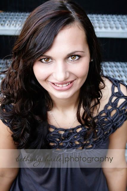
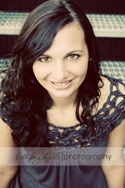
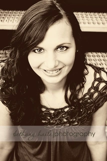
When I am editing pictures I always have a hard time deciding which tones I like the best. I love the soft looks of black and whites or sepia tones images, but I really love the boldness that you get with a full color. And if you have read my blog much you know I am a sucker for a faded "70's" look too. So here are three choices that I am playing with. There are different things that I like about each of them...but I am curious what your opinions are! Leave a comment and let me know what you think!
6 comments:
As much as I love black & white and sepia.....I think the lines of her hair and top get lost with the dark colors. So my vote is NOT for the sepia one just on that thought.
After looking again, I vote for the middle one. Is this the "faded" one? The stairs behind her aren't as eye-catching and isn't competing with the color of her top.
Lol. You got me on a run Bethany!
The full color is the best because the contrast of her eye color just "pops". Good work!
I have to agree. The thing about the top picture that I love is her eyes. They just reach out and grab me. The other two photos are pretty cool, but the pull of her eyes gets lost in the monotone, which, for me, ruins the effect.
I like the full color the best on this one.
Full color for that pic. Very gorgeous girl.
gonna have t agree with the last 4 commenters...her hair and eyes look best in the full color one, although I can see what "Matt and Erin" is saying about the stairs being a bit distracting...but not much. I might almost punch up the saturation a smidgeon to get a richer color on hair and eyes and cut down on the stairs...or something. I am not that good at people photography though. =)
Post a Comment